Platform-Specific Social Media Formats: Guide

Posting the same content across platforms? That’s a mistake. Each platform has unique formats, audience habits, and technical requirements. Success depends on tailoring your content to fit these differences. Here’s what you need to know:
- Instagram: Focus on visuals. Use 1080x1080 (square) or 1080x1350 (portrait) for feed posts, and 1080x1920 (vertical) for Stories/Reels. Keep captions short, engaging, and hashtag-focused (3–5 hashtags).
- LinkedIn: Prioritize professional tone. Use 1200x627 (landscape) or 1080x1080 (square) images. Articles and carousels work well; keep posts concise with 3–5 relevant hashtags.
- X (Twitter): Stay concise. Limit posts to 280 characters, with 1200x675 visuals. Use threads for longer ideas and 1–2 hashtags naturally.
- Facebook: Use 1200x630 (landscape) or 1080x1080 (square) visuals. Captions under 80 characters perform best. Stories/Reels thrive with 1080x1920 dimensions.
Accessibility is critical: Add alt text, ensure strong color contrast, and use captions for videos. Tools like Draft AI can streamline creating platform-specific content, saving time while ensuring compliance with technical and accessibility standards.
The Right Size to Use for Social Media Graphics (2025)
Basic Formatting Rules for All Platforms
Getting your content to look great across all platforms starts with following some universal formatting rules. These guidelines ensure your posts are professional, accessible, and visually appealing no matter where they appear. Skipping these basics can lead to problems like cropped images, unreadable text, or content that doesn’t accommodate users with accessibility needs.
Technical Requirements
Each social media platform has its quirks, but some technical details stay consistent. Aspect ratios are key: a 1:1 square format works almost everywhere, 4:5 (portrait) is ideal for mobile screens, and 16:9 (landscape) is perfect for videos.
When it comes to image quality, resolution is more important than file size. Stick to at least 1080 pixels on the shortest side to keep your visuals sharp on high-resolution displays. For example, use 1080 x 1080 pixels for square posts or 1080 x 1350 for portrait images. Lower resolutions can result in blurry or pixelated content, especially on larger screens.
Stick with standard file formats for smooth uploads. Use JPG for photos and PNG for graphics with text or transparent backgrounds. For videos, MP4 with H.264 encoding is the go-to format. Avoid uncommon formats like TIFF or AVI, as they may not upload correctly or could be heavily compressed. Keep video files under 1 GB for easier uploads.
Text matters, too. Most platforms cut off longer captions after the first 125 characters on mobile, so start with a strong hook or call-to-action. Use line breaks to improve readability, and avoid ALL CAPS, which can come across as shouting or trigger spam filters. Emojis can add a nice visual touch, but keep it subtle - one or two per paragraph is usually enough. And always test special characters to ensure they display correctly across devices.
Once you’ve nailed the technical details, it’s time to make sure your content is accessible to everyone.
Accessibility Requirements
Accessibility isn’t just a nice-to-have - it’s essential. It helps you reach more people and, in some cases, meets legal requirements. Start by adding alt text to images. This text should clearly describe the image’s purpose. For instance, instead of “image of product,” go for something like “blue wireless headphones on a wooden desk next to an open laptop.”
When adding text to images, make sure it’s legible on all devices. Use at least 24-point font for body text and 36-point font for headlines. Smaller text can become unreadable on mobile screens, so always test your designs on a smartphone before posting.
Color contrast is another critical factor for readability. The Web Content Accessibility Guidelines (WCAG) recommend a contrast ratio of at least 4.5:1 for normal text and 3:1 for larger text. In simple terms, use dark text on light backgrounds or light text on dark backgrounds. Avoid low-contrast combinations like light gray on white or navy blue on black. Tools like WebAIM’s Contrast Checker can help you ensure your designs meet these standards.
Be mindful of where you place text in your images. Avoid putting important information near the edges, where it might be obscured by profile pictures, usernames, or action buttons. Center-weighted designs tend to work best, as they keep the focus on your message regardless of how the platform crops the image.
For videos, captions and subtitles are a must. Many users watch videos without sound, especially on platforms like Facebook. Whether you embed captions directly into the video or use platform-specific captioning tools, this addition benefits users who are deaf or hard of hearing, as well as those in noise-sensitive environments.
With these technical and accessibility standards in place, you’re ready to adapt your content to fit each platform’s unique style.
Adapting Content for Multiple Platforms
Creating separate content for every platform can be overwhelming, but you don’t have to start from scratch each time. Instead, create a strong base piece and tweak it to fit each platform’s strengths. For example, if Instagram is your primary platform, start with a visually striking image at 1080 x 1350 pixels and pair it with a caption optimized for hashtags. From there, resize and reformat the content to suit other channels.
Adjusting dimensions is one of the easiest ways to adapt content. A high-resolution image - say, 1920 x 1920 pixels - can be cropped into different aspect ratios without losing quality. When designing, keep critical elements within a “safe” zone to avoid cropping issues. For videos, shooting in 4K at a standard 16:9 ratio gives you the flexibility to crop for vertical formats like 4:5 or 9:16.
Captions also need to fit the platform’s style. On LinkedIn, audiences expect longer, more detailed posts with clear paragraph breaks and professional insights. On X (formerly Twitter), brevity is key - stick to concise, punchy statements. Instagram, on the other hand, strikes a middle ground, favoring engaging storytelling with a strong opening line. Instead of simply trimming captions, rewrite them to match the tone and expectations of each audience.
Hashtag usage varies by platform, too. Instagram posts work well with 3–5 targeted hashtags, either in the caption or the first comment. On LinkedIn, 3–5 industry-specific hashtags at the end of a post perform best. For X, stick to 1–2 hashtags naturally woven into the text, while on Facebook, hashtags are less critical and can be used sparingly or skipped altogether.
Finally, don’t overlook visual tweaks. Text overlays, color schemes, and graphic styles that work on one platform might not translate well to another. You may need to reposition text, adjust colors, or modify design elements to align with the aesthetic norms of each channel. By tailoring your content this way, you can maximize its impact across all platforms.
Instagram Formatting Guidelines
Instagram’s visual nature makes precise formatting essential for feed posts, Stories, and Reels. By adhering to the platform’s requirements, your content can stand out while maintaining a polished and professional look. Let’s dive into the specifics of creating content that works seamlessly on Instagram.
Image and Video Dimensions
Instagram supports multiple content formats, each with its own optimal dimensions:
- Feed posts: The classic square format at 1080 x 1080 pixels ensures consistent display across devices. For a more vertical layout, use 1080 x 1350 pixels (4:5 ratio), which takes up more screen space on mobile. Landscape images work best at 1080 x 566 pixels (1.91:1 ratio) but occupy less of the screen.
- Stories and Reels: Both require a vertical format of 1080 x 1920 pixels (9:16 ratio). Be mindful of Instagram’s interface overlays (like captions or buttons) and place key visuals in the center to avoid obstruction.
- Carousel posts: Maintain consistent dimensions across all slides for a smooth viewing experience. Stick to one format - either all square or all portrait - for a cohesive look.
When exporting video files, Instagram prefers MP4 with H.264 compression and AAC audio. Keep feed videos under 60 seconds and under 650 MB. Reels can be up to 90 seconds, while Stories are typically split into 15-second segments, with longer videos automatically divided.
Caption and Hashtag Tips
Instagram captions allow up to 2,200 characters, but only the first 125 characters are visible without tapping "more." Your opening line should immediately grab attention - whether it’s a bold statement, a question, or a benefit that hooks the reader.
To improve readability:
- Use line breaks to separate ideas, but note that Instagram sometimes collapses extra spaces. Use symbols like dashes or periods on blank lines to preserve spacing.
- Keep paragraphs short (2–3 sentences) and add blank lines between them for easy scrolling.
- Emojis can enhance engagement but should be used sparingly - one or two per paragraph is enough.
When it comes to hashtags, focus on relevance and specificity. While you can use up to 30, research suggests that 3–5 targeted hashtags often yield better results. Combine broad hashtags (with over 100,000 posts) with niche ones (under 50,000 posts) to balance reach and competition. Place hashtags at the end of your caption or in the first comment for a cleaner look.
For clarity, avoid spaces or special characters in hashtags. Use camel case (e.g., #SocialMediaTips) to improve readability, especially for users relying on screen readers.
Mentions and tags are also key tools. Tag collaborators or brands in your caption with the @ symbol, and use image tags (up to 20 per post) to extend visibility without cluttering your caption.
Text Placement on Images
When adding text to images, consider how Instagram’s interface might obscure your content. For Stories and Reels, leave a buffer around the edges to avoid covering important text with profile icons, buttons, or stickers.
To ensure readability:
- Use clean, modern fonts like Helvetica, Arial, or Montserrat, which are easy to read on small screens.
- Maintain strong contrast between text and background. For busy or colorful backgrounds, add a subtle blur or place text in a semi-transparent box to make it stand out.
- Align longer text blocks to the left for natural reading flow, while center alignment works better for short headlines or impactful phrases. Avoid justified text - it can create awkward spacing on mobile.
Negative space is your friend. Leaving empty areas around your text reduces clutter and helps your message stand out. A clean design is often more effective than one overloaded with visuals.
Consistency is key to building a recognizable brand. Use the same fonts, colors, and text placement styles across posts to create a cohesive look in your profile grid.
When designing for multiple formats, start with the most restrictive dimensions. For example, if you plan to share a graphic as both a Story and a feed post, design it using Story dimensions (1080 x 1920 pixels) but ensure all critical elements fit within the square (1080 x 1080 pixels) to avoid cropping issues on the feed.
LinkedIn Formatting Guidelines
LinkedIn's professional environment requires a thoughtful approach to formatting. To stand out in a crowded feed, your content should be visually appealing while maintaining a polished, business-appropriate tone. By understanding LinkedIn's technical specifications and user habits, you can create posts that grab attention and encourage engagement. Below are detailed guidelines for optimizing your LinkedIn content.
Image and Video Dimensions
LinkedIn's image and video requirements vary depending on the type of content you're sharing. Following these dimensions ensures your visuals look sharp and avoid unwanted cropping or compression.
- Standard image posts: Use 1200 x 627 pixels (1.91:1 ratio) for landscape images, ideal for infographics or charts. For a square format, go with 1080 x 1080 pixels, or opt for portrait images up to 1200 x 1500 pixels (4:5 ratio). Keep file sizes under 5 MB and use PNG or JPEG formats.
- Video posts: Native videos perform well on LinkedIn. Use 1920 x 1080 pixels (16:9) for landscape or 1080 x 1350 pixels (4:5) for vertical videos. Videos can range from 3 seconds to 10 minutes, with a maximum file size of 5 GB. MP4 format with H.264 compression works best.
- Company page visuals: For cover images, use 1128 x 191 pixels to ensure proper display across devices. Your company logo should be at least 300 x 300 pixels, though higher resolutions are recommended for clarity.
Caption and Article Structure
LinkedIn shows only the first 140–210 characters of a post before adding a "see more" link, making your opening sentence crucial. Start with a strong, attention-grabbing statement. For example, instead of saying, "I've been thinking about productivity lately", try, "I saved 15 hours last week by cutting these three types of meetings." This approach gives readers a clear reason to click for more.
For longer posts, use short paragraphs of 2–3 sentences with blank lines in between. This creates white space, making your content easier to read and scan. While LinkedIn doesn't offer native bold or italic text, you can use external tools or Unicode characters to add emphasis sparingly.
When writing LinkedIn articles, you have more flexibility. Articles can be up to 125,000 characters and support features like headers, bullet points, images, and embedded media. Use H2 and H3 headers to break up sections, and include visuals every 300–400 words to keep readers engaged.
Hashtags are effective on LinkedIn but work differently than on platforms like Instagram. Stick to 3–5 relevant hashtags at the end of your post. Focus on established tags like #Leadership or #Technology, or use niche industry tags for more targeted engagement.
Mentions (@username) can increase visibility when the tagged person or company interacts with your post. Tag collaborators, clients (with their permission), or thought leaders, but avoid over-tagging - it can come off as spammy.
PDF Carousel Formatting
LinkedIn's PDF carousel feature is a highly engaging way to share multi-page content. These swipeable carousels encourage users to spend more time with your post and are particularly effective for showcasing reports, guides, or presentations.
- File setup: Design your carousel as a PDF with pages sized at 1080 x 1080 pixels (square) or 1920 x 1080 pixels (landscape). Square formats generally perform better on mobile, where most LinkedIn users access the platform. Files can be up to 300 MB with a maximum of 300 pages, though engagement typically drops after 10–15 slides.
- Design tips: Use large, readable fonts - at least 24-point for body text and 40-point or larger for headers. Stick to a consistent color scheme, fonts, and layout across all slides. Place your logo subtly in a corner rather than letting it dominate the design. High contrast between text and background colors ensures readability, especially on mobile devices.
- First and final slides: Your first slide should act as a hook, featuring a compelling headline and visual that communicates the value of the carousel. On the last slide, include a call-to-action (e.g., "Visit our website" or "Connect with me on LinkedIn"). Make it specific and actionable.
- Exporting: Save your file as a PDF in RGB color mode (not CMYK, which is for print). Compress images to keep file sizes manageable while maintaining quality. LinkedIn’s compression can reduce image clarity, so start with high-resolution graphics.
To improve user experience, add page numbers (e.g., "3/10") to your slides. This transparency helps viewers gauge the time commitment and can increase completion rates.
X (Twitter) Formatting Guidelines
X (formerly Twitter) thrives on quick, real-time interactions. Its fast-paced environment means your posts need to be short, visually appealing, and formatted to grab attention. By understanding the platform's specs and user habits, you can create posts that boost engagement and grow your audience. Here's how to make the most of your content on X.
Character Limits and Thread Structure
X allows 280 characters per post for standard accounts, but shorter posts often perform better. Aim for around 100–150 characters to keep your message sharp and leave space for retweets with comments.
For longer ideas or stories, use threads. Start with a strong opening line that hooks readers. For example, instead of "Here are some tips on social media formatting", try "I spent 6 months testing social media posts. Here's what actually worked." Number each tweet in the thread (e.g., "1/7", "2/7") so readers can follow along easily. Use line breaks in a text editor before posting to ensure proper formatting, as X may remove extra spacing.
Always end your thread with a call-to-action. Whether you’re asking readers to share their thoughts, follow you, or check out a resource, give them a clear next step. If you're including links, add them in the final tweet or a reply, as X's algorithm tends to deprioritize posts with external links, which can reduce engagement.
Now that your text is ready, let’s look at how visuals can maximize your post's impact.
Image and Video Dimensions
Visuals are a game-changer on X. Posts with videos can generate up to ten times more engagement compared to text-only posts.
For images, use 1200 x 675 pixels (16:9 ratio) to ensure they display properly without cropping. This format is ideal for graphics, screenshots, or promotional visuals. If you’re sharing multiple images (up to four per post), X arranges them in a grid. Two images appear side-by-side (2:1 ratio), three show as one large image with two smaller ones, and four form a square grid. Keep critical text and elements centered to avoid cropping. Stick to files under 5 MB in PNG or JPEG format.
For videos, both landscape and vertical formats are supported. Use 1920 x 1080 pixels (16:9) for landscape videos or 1080 x 1920 pixels (9:16) for vertical ones. Videos can range from 2 seconds to 2 minutes and 20 seconds, with a maximum size of 512 MB. MP4 format with H.264 compression provides the best quality. Since X automatically selects a thumbnail, start your video with an eye-catching frame.
GIFs are another great option for quick reactions or demonstrations. Keep them under 15 MB and no longer than 6 seconds for smooth playback and quick loading.
Hashtag and Mention Usage
Hashtags, mentions, and links are powerful tools on X, but using them wisely is key to avoiding clutter or algorithmic penalties.
Hashtags can boost visibility significantly. Tweets with hashtags are 33% more likely to be retweeted and can improve metrics like brand awareness and purchase intent. Stick to 1–2 relevant hashtags per post to keep things clean. Place them naturally within your text rather than tacking them on at the end. For example, "Check out our new #SocialMedia guide for small businesses" is more engaging than "Check out our new guide #SocialMedia #Marketing #SmallBusiness."
Using a mix of one niche hashtag (e.g., #B2BContentStrategy) and one broader hashtag (e.g., #Marketing) can help you reach both specific and wider audiences. Always check trending hashtags for relevance, but don’t force them into your posts if they don’t align with your content - it can come across as insincere.
To improve readability, capitalize the first letter of each word in hashtags (e.g., #SocialMediaMarketing). Avoid spaces or punctuation, as these break the hashtag (e.g., use #SocialMedia, not #Social Media). Track your hashtag performance using X's analytics or third-party tools to refine your approach over time.
Mentions (using @username) are a great way to engage others and expand your audience. Tag collaborators, clients, or influencers sparingly to avoid being flagged as spam. Be sure to use the exact handle, as X doesn’t auto-suggest usernames when tagging.
Links need careful handling. While they can drive traffic to other platforms, X's algorithm tends to favor posts that keep users on the platform. Ads without hashtags or mentions, for example, generate 23% more clicks when driving traffic to external sites. Social Media Today’s Andrew Hutchinson explains:
X really doesn't want its users to click on referral links and leave the site.
To work around this, include links in the comments or a follow-up post rather than the main tweet. If you do include links, use a URL shortener like bit.ly for a cleaner look and to track clicks. Always provide context for the link so readers know what they’re clicking on.
sbb-itb-9f5fe42
Facebook Formatting Guidelines
Facebook remains a go-to platform for connecting with a wide audience, from personal networks to professional communities. To make your posts stand out and drive engagement, proper formatting is key. Knowing how to tailor your content for Facebook’s feed, Stories, and Reels can help you boost visibility and connect more effectively with your audience.
Image and Video Dimensions
Getting the dimensions right ensures your visuals look clean and professional without cropping or pixelation.
- Feed images: Use 1200 x 630 pixels (1.91:1 ratio) for shared links, promotions, or general posts. For square images, stick to 1080 x 1080 pixels (1:1 ratio). File sizes should be under 4 MB in JPEG or PNG format.
- Carousel images: Facebook arranges these based on the number of images. Two images appear side-by-side, three create a larger image on the left with two smaller ones on the right, and four form a grid.
- Feed videos: Horizontal videos work best at 1280 x 720 pixels (16:9 ratio), while vertical videos should be 1080 x 1350 pixels (4:5 ratio) to maximize mobile screen space. Videos can range from 1 second to 240 minutes, but shorter videos (under 2 minutes) tend to perform better. Use MP4 or MOV formats with H.264 compression, keeping file sizes under 4 GB.
- Stories and Reels: Both require 1080 x 1920 pixels (9:16 ratio) for full-screen vertical content. Stories disappear after 24 hours unless saved as Highlights, while Reels remain permanently on your profile and can appear in the Reels tab. Reels can be 3 to 90 seconds long, with a maximum file size of 4 GB.
Always center key elements to prevent cropping on mobile screens.
Caption and Link Structure
Short and punchy captions perform best on Facebook. Posts under 80 characters can achieve a 66% higher engagement rate compared to longer ones. Aim for 40-80 characters to hit the sweet spot. If you need more space to tell your story, focus on structuring your content for readability.
- Grab attention early: Start with a strong hook that appears before the "See More" cutoff. For example, instead of saying, "We're excited to share some tips", go for something like, "This one mistake is killing your engagement" or "Here’s what 6 months of testing taught me about Facebook posts."
- Break up text: Use short paragraphs of 1-3 lines with line breaks for better readability. Avoid long blocks of text, as these can overwhelm readers and hurt engagement.
- Emojis: Use them strategically to highlight emotions, actions, or key points. For example, they can act as bullet points or draw attention to calls-to-action, but avoid overusing them.
- Visual hierarchy: Create emphasis with all caps, emojis, or asterisks (*). For example, "🎯 THE PROBLEM" followed by "✅ THE SOLUTION" can make your post more engaging. Highlight important phrases like calls-to-action using formatting tricks.
Always end with a clear call-to-action. Instead of vague prompts like "Let us know what you think", use specific ones like "Click to learn more", "Share your thoughts below", or "Grab the offer before it ends!".
When including links, ensure they are clickable and drive traffic directly to your website or landing page. Customize the link preview - adjust the image, title, and description - for higher engagement. A compelling preview can significantly increase click-through rates.
Use hashtags sparingly. Stick to 1 to 3 relevant hashtags, and incorporate them naturally into your sentences instead of tacking them on at the end. For example, "Get a chance to win a #GoProHero12" reads better than ending with a long string of hashtags. Avoid spaces, punctuation, or symbols in hashtags (e.g., use #TacoTuesday, not #Taco Tuesday).
Stories and Reels Formatting
Stories and Reels are excellent tools for delivering immersive, mobile-first content.
- Stories: Use a minimum font size of 40-50 pixels and keep key elements within the 1080 x 1420 safe zone to avoid cropping. Add interactive features like stickers, polls, and question boxes to boost engagement. Stories work well for time-sensitive content like flash sales or event updates. Include a clear call-to-action, such as text overlays or the "Swipe Up" feature (available for accounts with 10,000+ followers or verified accounts).
- Reels: These require more polished production since they remain on your profile permanently. Start with a strong first frame to grab attention - Reels autoplay in feeds, so the opening second is crucial. Use on-screen text to reinforce your message, as many users watch with sound off. Keep your text concise and easy to read.
Hook viewers within the first 3 seconds by using a surprising statement, question, or visually striking moment. Use trending audio tracks when relevant, as Facebook’s algorithm often favors Reels with popular sounds. While Facebook allows Reels up to 90 seconds long, sticking to 15-30 seconds is ideal for holding attention. End with a clear call-to-action, such as encouraging viewers to follow, comment, or share.
Maintain consistent branding across Stories and Reels by using the same color palette, fonts, and style. If you’re creating a series, keep the visuals cohesive so your audience immediately recognizes your content.
Finally, use Facebook Insights to determine the best times to post. Reels have the advantage of appearing in multiple places - your profile, the Reels tab, and followers’ feeds - giving them a longer lifespan compared to Stories.
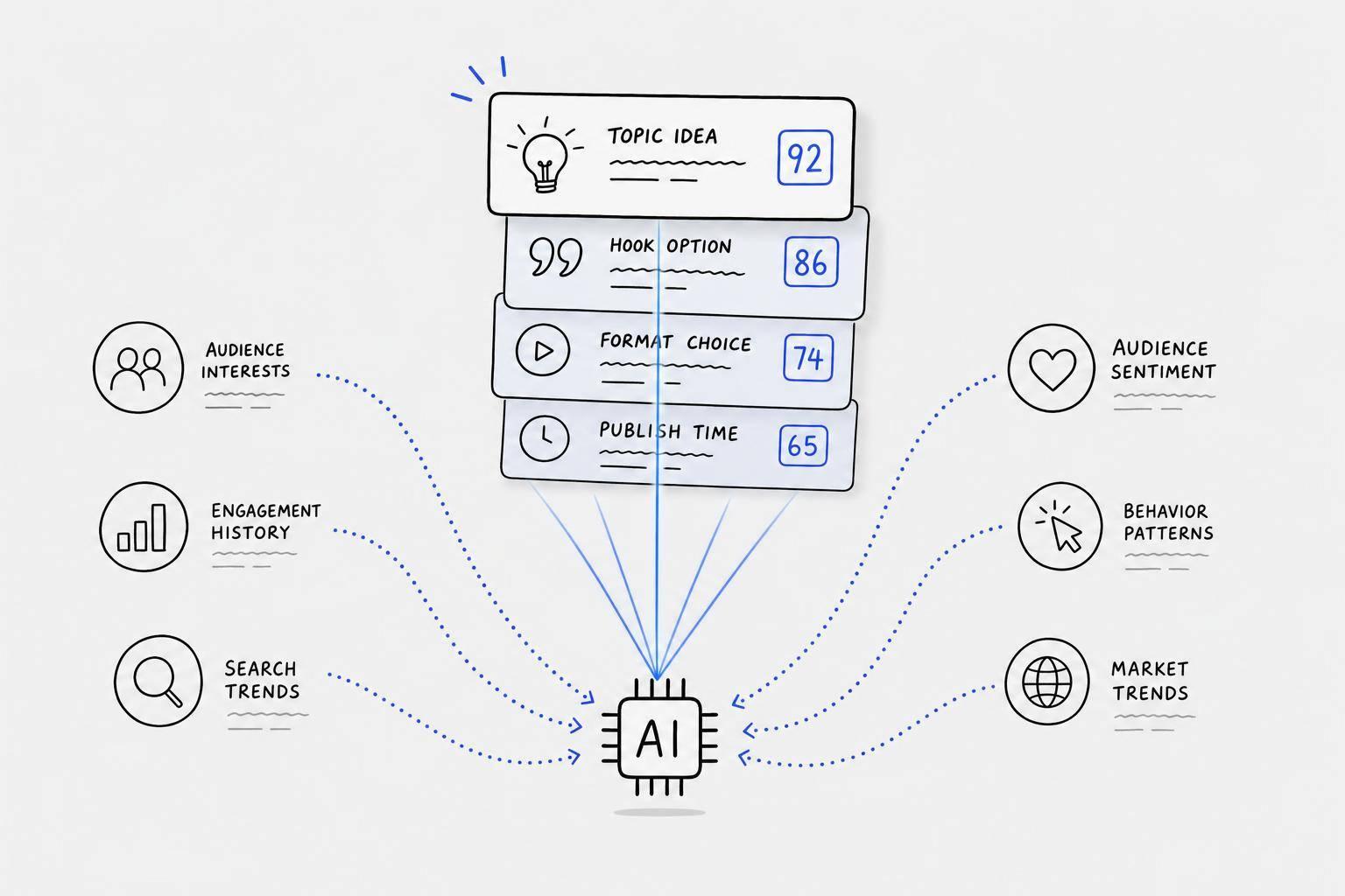
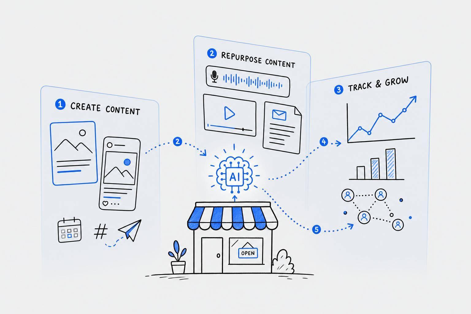
Using AI Tools for Content Formatting
When it comes to meeting the diverse technical and visual requirements of platforms like Instagram, LinkedIn, X, and Facebook, AI tools can make the process far more manageable. Instead of juggling the complexities of each platform, these tools transform your raw ideas - whether typed or spoken - into polished posts that align with each platform's unique guidelines. This allows you to focus on the bigger picture, like crafting strategies that drive engagement.
Creating Platform-Ready Content with Draft AI
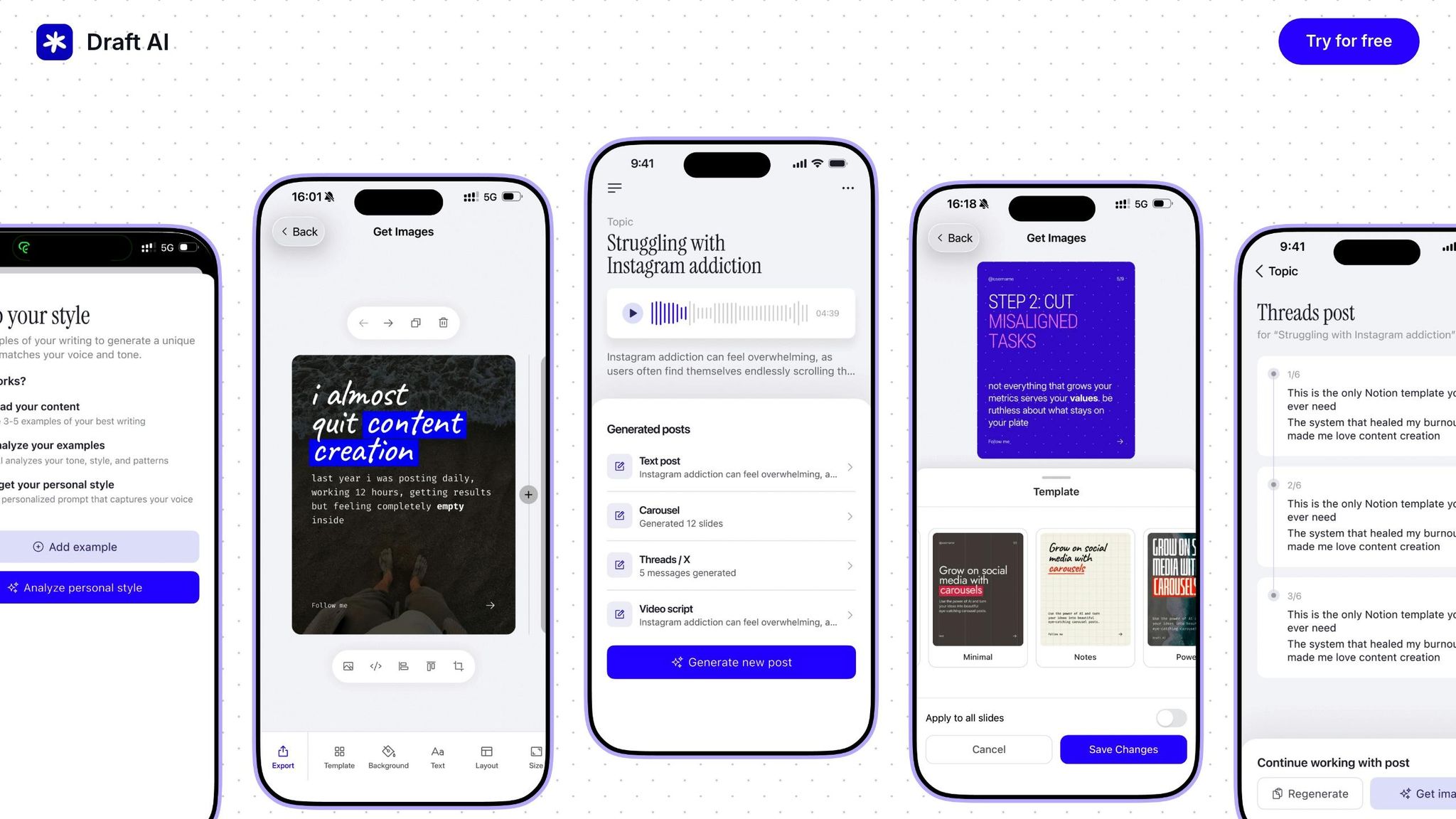
Draft AI takes the heavy lifting out of content creation by turning your raw input into ready-to-publish posts. Whether you provide text or a voice recording, it delivers platform-optimized content in just minutes.
For LinkedIn, it organizes your content to fit the platform’s norms and even suggests ideal image layouts. On Instagram, it tweaks captions and image placement to ensure nothing important gets cropped out. For X, it breaks down longer ideas into a series of concise, connected posts.
The voice message feature is a game-changer for busy professionals. Simply record your thoughts on the go, and Draft AI will generate structured posts complete with formatting, hashtags, and calls-to-action. It can even create carousels for platforms like LinkedIn and Instagram, arranging your content into visually balanced, multi-slide posts that maintain a consistent look.
Using Draft AI Templates
Draft AI’s pre-built templates make content creation faster and easier. These templates come with ready-made layouts, placeholder text, and built-in formatting that follows best practices. They’re also fully customizable, so you can adapt them to match your brand’s style.
Start by picking a template that fits your goal. For example, use an announcement template to introduce a new service or an educational template to share industry insights. The smart layout feature adjusts your content automatically, ensuring smooth transitions between formats - like turning an Instagram post into a LinkedIn article - without the need to start from scratch.
With multiple size options and precise text controls, you can ensure your message looks great and stays engaging on any platform. These templates are designed to maintain visual consistency and clarity while adhering to the formatting standards previously discussed.
Multilingual and Custom Writing Styles
Draft AI also excels at breaking language barriers. Its multilingual translation feature not only converts your posts into different languages but also adapts idioms and expressions to fit the cultural context of your audience. This ensures your message feels natural and relatable, no matter where your audience is located.
You can also customize the tone of your content to match your brand’s voice. Whether you want a professional, conversational, or playful tone, Draft AI lets you set style parameters to ensure consistency. You can even create different style profiles for specific audience segments, tailoring your messaging to be both engaging and relevant for each group.
With its combination of ready-to-use templates, customizable designs, multilingual capabilities, and personalized writing styles, Draft AI simplifies the entire content creation process. It allows you to craft platform-specific, audience-focused posts that resonate across channels and cultures.
US Localization and Compliance
Adapting content for US audiences means aligning formats, measurements, and legal standards to meet local expectations. These details are crucial for building trust and avoiding confusion.
US Formatting Standards
American audiences expect specific formatting conventions, and getting them wrong can lead to misunderstandings or make your content seem unpolished.
Date formatting in the US follows the MM/DD/YYYY structure. For example, an event on March 5, 2026, should be written as 03/05/2026 or March 5, 2026 - never 05/03/2026, which Americans would interpret as May 3. If you're scheduling posts across platforms, ensure date formats are consistent in captions, graphics, and video overlays.
Currency displays require the dollar sign ($) before the number, with commas separating thousands. Examples include $1,500 or $15,000 - not 1500$ or 15.000$. For cents, use a decimal point: $19.99, not $19,99. Proper placement of the dollar symbol is key to maintaining clarity.
Number formatting uses commas for thousands and periods for decimals. For instance, write 10,000 users or a 3.5% engagement rate. When creating infographics or data visualizations, stick to this format across all slides to avoid confusion.
Measurements and units should use the imperial system. Temperatures are in °F, distances in miles or feet, and weights in pounds or ounces. Whether you're discussing product dimensions, travel distances, or weather, converting to imperial units ensures the content feels familiar to US readers.
Time zones are critical for live events or deadlines. Always specify the time zone, such as EST, CST, MST, or PST. For nationwide campaigns, include both coasts: "3:00 PM ET / 12:00 PM PT" works well for clarity.
Next, let’s dive into legal and disclosure requirements to ensure compliance with US regulations.
Legal Text and Disclosure Formatting
Social media platforms and the Federal Trade Commission (FTC) have strict rules about how legal disclosures and promotional content must be presented. Transparency is non-negotiable.
Disclosure visibility is a must. For sponsored content or affiliate links, disclosures should be clear, easy to spot, and placed upfront. On Instagram, for example, start captions with "#ad" or "#sponsored" instead of burying them after several lines or hiding them behind a "more" button. Avoid vague terms like "#collab" or "#partner" - they don’t meet FTC standards.
Text placement within safe zones ensures critical information isn’t obscured by platform interfaces. On Instagram and Facebook Stories, avoid placing text at the top or bottom where profile pictures or buttons could block it. Keep legal disclaimers and disclosures within the central 80% of the frame. For Instagram posts, remember that feed previews crop images to a square, so keep essential text in the center.
Font size and contrast are essential for readability. The FTC expects disclosures to be as prominent as the rest of your message. Use at least 14-point font for body text and 10-point for disclaimers. Ensure strong contrast between text and background colors; for example, light gray text on a white background won’t meet accessibility or legal standards.
Hashtag disclosures must stand alone. Use hashtags like #ad or #sponsored on their own, not combined with other words (e.g., #amazingproduct#ad). The goal is for users to immediately understand the commercial nature of the post.
Material connection statements should be explicit. If you received compensation, free products, or other benefits, state this clearly. For example, write "Thanks to [Brand] for sponsoring this post" or "I received this product for free in exchange for my honest review." Avoid ambiguous language that might confuse readers.
Before publishing, a thorough review is essential to confirm compliance with US-specific standards.
Pre-Publishing Review Checklist
To ensure your content is ready for US audiences, go through the following checks before hitting publish.
Format verification for numbers and dates:
- Ensure dates follow the MM/DD/YYYY format.
- Verify currency uses $ with commas for thousands.
- Confirm measurements are in imperial units (°F, miles, pounds).
- Check time zones for accuracy.
- Review decimal points and thousand separators for consistency.
Legal compliance review for disclosures:
- Confirm sponsored posts include clear, upfront disclosures like #ad or #sponsored.
- Verify affiliate links are properly disclosed.
- Check that health, financial, or legal claims include necessary disclaimers.
- Ensure contest or giveaway posts include official rules or a clear link to them.
Text visibility check for mobile devices:
- Test Instagram Stories to ensure text stays within safe zones.
- Review Facebook posts to confirm important text isn’t truncated.
- Preview LinkedIn carousels to ensure text remains legible at thumbnail size.
Accessibility verification to meet basic standards:
- Confirm text has strong contrast against backgrounds.
- Ensure time-sensitive details (like sale end dates) are clearly visible.
- Verify captions are enabled for videos.
- Check that text overlays are readable by screen readers.
Brand consistency review for alignment with guidelines:
- Ensure custom fonts are legible at small sizes.
- Verify color choices maintain strong contrast.
- Confirm tone matches brand voice while meeting disclosure rules.
Cross-platform consistency for seamless adaptation:
- Check that dates, prices, and measurements are formatted consistently across platforms.
- Ensure platform-specific adjustments don’t alter key details or introduce conflicting information.
Troubleshooting and Quality Checks
Let’s dive into some practical steps for tackling common formatting problems and ensuring your content looks polished and professional.
Common Formatting Errors
Even the most experienced creators can run into formatting hiccups. These issues not only affect the appearance of your posts but can also harm your credibility. Here’s how to address some of the most frequent problems:
- Cropped text: Instagram Stories often trim text at the top or bottom, especially on different phone models. To avoid this, keep all critical elements - like calls-to-action or key details - within the center 80% of the frame. For feed posts, remember that the square preview might cut off text placed near the edges.
- Blurry images: Uploading low-resolution files can result in pixelation. For Instagram, stick to 1080 x 1080 pixels for square posts. Facebook compresses images heavily, so starting with a high-resolution file (at least 2048 pixels on the longest side) ensures better quality. Use PNG for graphics and JPG for photos to maintain sharpness.
- Truncated captions: Platforms like LinkedIn only show the first two lines of a post before prompting users to click "see more." Facebook and Instagram also limit feed previews to about 125 characters. Place your most important information up front to grab attention, and expand on the details further down.
- Inconsistent aspect ratios: Awkward aspect ratios can disrupt the viewing experience. Always resize and reframe your content to match each platform's preferred dimensions.
- Hashtag clutter: Overloading captions with hashtags can make them hard to read. Use hashtags sparingly and, if needed, place them at the end of the post or in a separate comment.
- Font readability issues: Small, overly decorative, or low-contrast fonts can be hard to read, especially on smaller screens. Stick to clean, sans-serif fonts like Arial or Open Sans for the body text, and aim for sizes around 14 points for captions and 18 points for headlines.
- Video formatting problems: Issues like incorrect dimensions, missing captions, or oversized files can reduce video quality. For example, X (Twitter) limits videos to 512 MB, while Instagram allows up to 4 GB. Always add captions, as many users watch videos without sound.
- Link preview failures: If URLs don’t generate proper thumbnails or descriptions, your post can look incomplete. Facebook and LinkedIn pull metadata from your website, so ensure your Open Graph tags are correctly set up. Test links by pasting them into the platform’s composer to review the preview.
Pre-Publishing Checklist
Before hitting "publish", take a moment to confirm that everything is in order. A quick checklist can save you from common pitfalls:
- Verify dimensions and aspect ratios: Ensure your content aligns with platform specs. For example, Instagram feed posts should be 1080 x 1080 pixels for square images, 1080 x 1350 pixels for portrait images, and 1080 x 566 pixels for landscape images. Stories require a 9:16 ratio (1080 x 1920 pixels). Double-check these dimensions to avoid unwanted cropping.
- Test text visibility: Use a preview tool or send yourself a test post to confirm text placement and size. This is especially crucial for Stories, where interface elements might block your content.
- Optimize file size: Large files can lead to upload errors or slow load times. Tools like TinyPNG can compress images without reducing quality.
- Proofread captions: Read your caption aloud to catch typos or awkward phrasing. Verify that line breaks, emojis, and links display correctly.
- Check hashtag relevance: Use hashtags that are specific and relevant to your audience. Avoid banned or overly generic ones that could limit reach.
- Review accessibility: Add alt text for images, enable captions for videos, and ensure color contrast meets accessibility standards (at least 4.5:1 for normal text).
- Preview on mobile: Since most users browse social media on their phones, check your content on a mobile device. Rotate the screen to see how it looks in both portrait and landscape modes.
Improving Engagement Through Formatting
Once your content meets technical standards, focus on formatting to encourage interaction and engagement.
- Use white space strategically: Break up dense text with shorter paragraphs and line breaks. On platforms like Instagram or LinkedIn, this improves readability and keeps users scrolling.
- Create visual hierarchy: Highlight key elements with larger, bold text and place critical information in the top third of images to ensure visibility. Bright, contrasting colors can draw attention to calls-to-action.
- Maintain consistent branding: Stick to your brand’s fonts, colors, and layout styles for a cohesive look. This helps your audience recognize your content instantly. Tools like Draft AI can save your brand’s design elements in templates, making it easier to stay consistent.
Conclusion
Getting your social media formatting right is key to ensuring your message lands as intended. Every platform has its own quirks - whether it’s image dimensions or character limits - and nailing these details ensures your content won’t end up cropped, compressed, or overlooked.
But it’s not just about technical specs. Tailoring your content to suit each platform’s unique vibe is just as important. A long, professional post brimming with insights might shine on LinkedIn but could fall flat on Instagram, where eye-catching visuals and short, snappy captions reign supreme. Taking the time to adjust your approach for each platform can be the difference between your post being ignored or stopping someone mid-scroll.
This guide has walked you through the essentials - covering the specs for Instagram, LinkedIn, X, and Facebook, along with practical tips to avoid common mistakes. We’ve also highlighted how features like alt text and captions can help make your content more inclusive, expanding your reach to a broader audience.
If juggling all these details feels overwhelming, tools like Draft AI can make life easier. Draft AI simplifies the process by transforming raw input - whether it’s text or voice - into polished, platform-ready posts. With pre-built templates, customizable styles, and even translation capabilities, it’s a handy way to create content that matches your tone, whether you’re going for professional, casual, or something in between.
FAQs
How can I make my social media content more accessible for everyone, including people with disabilities?
To ensure your social media content reaches and resonates with everyone, it's essential to prioritize accessibility. Here are a few simple ways to make your content more inclusive:
- Stick to clear and straightforward language so your message is easy to understand.
- Include subtitles, closed captions, or transcripts for videos, making them accessible to those who are deaf or hard of hearing.
- Provide alt text and detailed image descriptions for visuals, allowing screen readers to effectively describe your images to visually impaired users.
Taking these steps helps create a more welcoming and accessible space, ensuring that your content connects with a broader audience.
How can I adapt content for different social media platforms while keeping it engaging and high-quality?
To make your content work effectively on different social media platforms, start by getting to know the audience and features unique to each one. Platforms like Instagram, LinkedIn, X (formerly Twitter), and Facebook all have their own vibe, so your content’s format, tone, and style should match what users expect and enjoy on each.
One smart approach is to repurpose content for specific platforms. For instance, use in-depth, professional posts on LinkedIn, craft eye-catching carousels for Instagram, or share short, punchy updates on X. No matter the platform, keep your branding consistent - this helps build trust and recognition across your audience.
Don’t shy away from experimenting. Test different posting times, formats, and captions to see what clicks with your followers. Dive into your analytics to fine-tune your strategy. And remember, it’s all about balance - mix promotional content with posts that provide real value. This keeps your audience engaged and ensures your content hits home on every platform.
How can Draft AI make creating content for different social media platforms easier?
Draft AI makes crafting social media content for different platforms a breeze. It uses AI to create posts, scripts, and carousels that fit the unique style and requirements of platforms like Instagram, LinkedIn, X (formerly Twitter), and Facebook. All it takes is a few minutes to turn raw data or even voice inputs into polished, ready-to-share content.
The platform offers a range of features to help you fine-tune your content. These include customizable templates, options for fonts and colors, photo uploads, multilingual translation, and even AI-powered personal writing styles. With these tools, your content will feel tailored and professional, no matter where it's posted.