Ultimate Guide to Carousel Typography and Colors
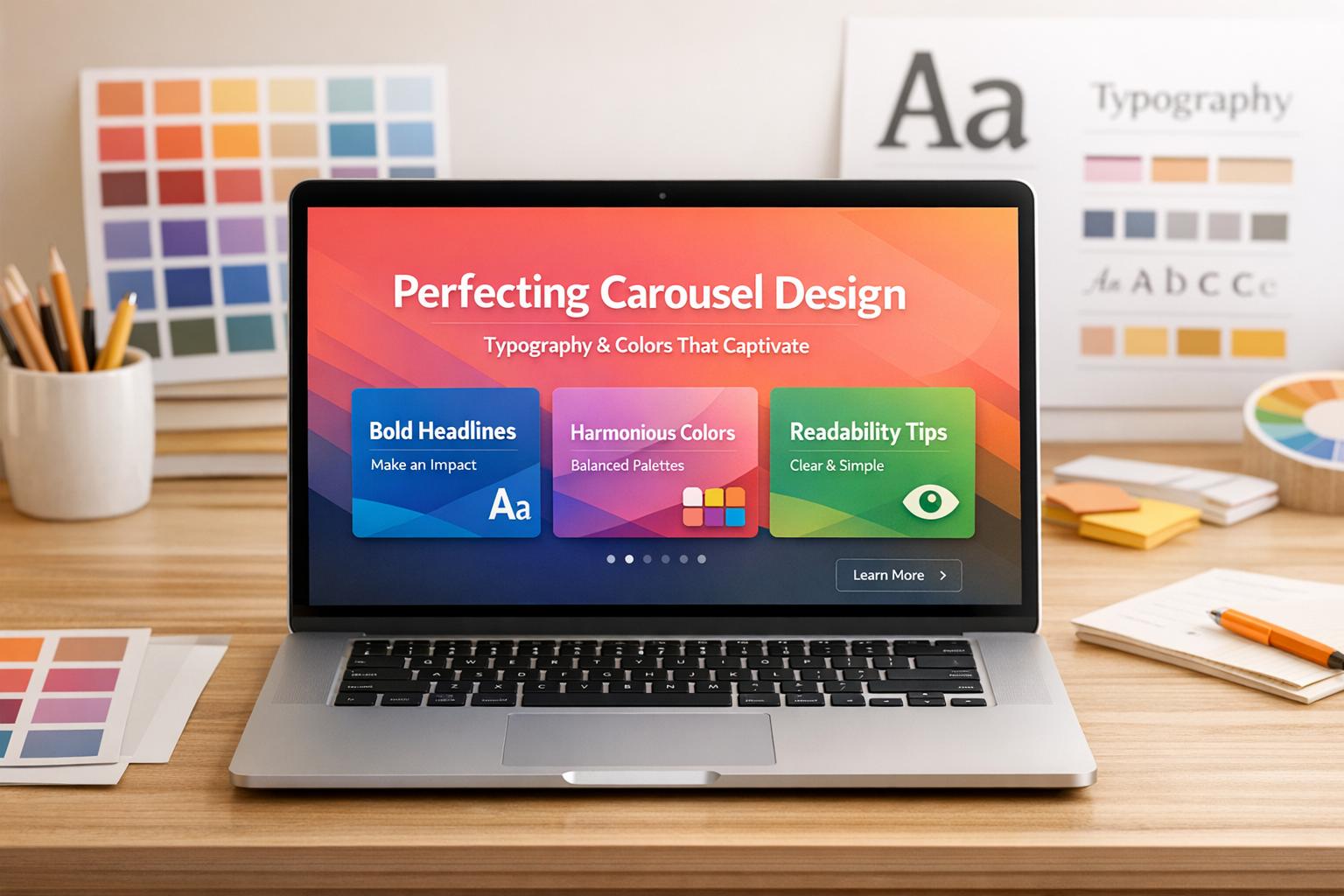
Typography and color choices can make or break your carousel's performance. Here's the bottom line: clear text, a structured hierarchy, and visually appealing color schemes are essential for grabbing attention and keeping users engaged - especially on mobile platforms like Instagram, where over 80% of users browse on their phones.
Key Takeaways:
- Typography Basics: Use at least 24pt for body text and 30–36pt for headlines. Maintain strong contrast and clear hierarchies (e.g., larger, bold titles paired with smaller, readable body text).
- Color Strategies: Apply the 60-30-10 rule - 60% dominant color, 30% secondary, 10% accent. Choose colors that align with your audience (e.g., bright tones for B2C, muted tones for B2B).
- Accessibility: Ensure text contrast meets WCAG standards (4.5:1 for normal text). Use tools like WebAIM’s Contrast Checker to test designs.
- Platform-Specific Design: Optimize for mobile-first platforms with bold fonts and high-contrast colors. Adjust for desktop-heavy platforms with professional tones.
To streamline the process, tools like Draft AI offer pre-designed templates that follow these principles, saving time and effort while ensuring your designs are optimized for performance.
How to Design Trending INSTAGRAM CAROUSEL | Step by Step Canva Tutorial
sbb-itb-9f5fe42
Typography Fundamentals for Carousels
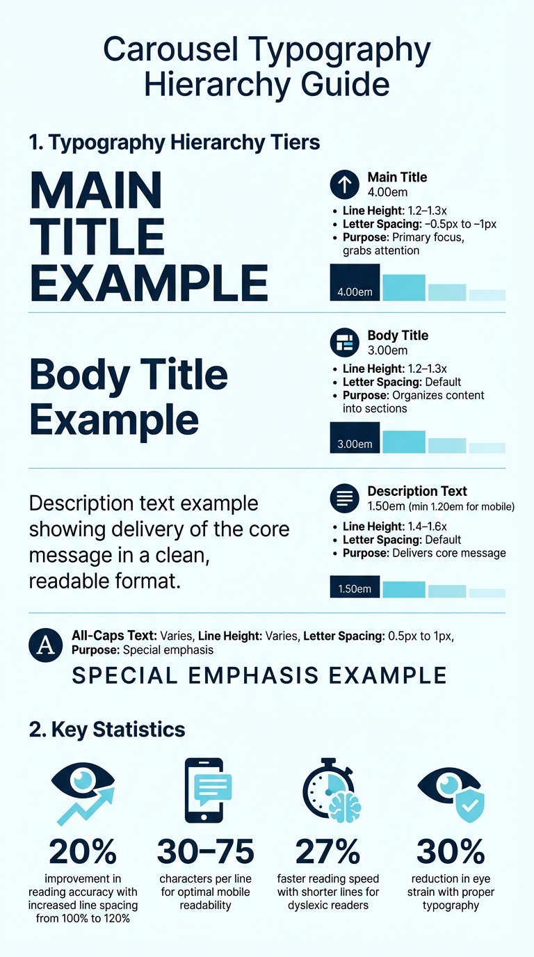
Carousel Typography Hierarchy Guide: Font Sizes, Line Heights, and Letter Spacing
Understanding Fonts, Sizes, and Text Hierarchy
Typography plays a huge role in web design, shaping how we interact with and absorb content. For carousels, nailing the typography basics - fonts (the typeface), sizes (text dimensions), and hierarchy (order of importance) - is key to creating a design that works seamlessly.
Carousels typically follow a three-tier hierarchy. At the top, the main title (4.00em) grabs attention as the primary focus. Below that, the body title (3.00em) organizes content into manageable sections. Finally, the description text (1.50em) delivers the core message. For mobile screens, ensure body text is at least 1.20em for easy readability.
To avoid cramped text, focus on line height (or leading). For body text, aim for 1.4–1.6 times the font size, while headings work best at 1.2–1.3 times. Studies show that increasing line spacing from 100% to 120% can improve reading accuracy by up to 20%. When it comes to letter spacing (tracking), headlines benefit from tighter spacing (–0.5px to –1px) for a polished look, while all-caps text requires slightly more space (0.5px to 1px) for better clarity.
Alignment also matters. For most text, left alignment is the easiest to read because it provides a consistent starting point for the eye. Center alignment can work for short headlines or captions, but justified text often creates awkward gaps that disrupt the flow.
| Element | Font Size | Line Height | Letter Spacing |
|---|---|---|---|
| Main Title | 4.00em | 1.2 – 1.3x | –0.5px to –1px |
| Body Title | 3.00em | 1.2 – 1.3x | Default |
| Description | 1.50em | 1.4 – 1.6x | Default |
| All-Caps Text | Varies | Varies | 0.5px to 1px |
Once you’ve mastered these basics, the next step is choosing the right fonts to bring your carousel to life. You can also compare AI tools for carousel design to speed up this process.
Selecting Fonts That Work
For carousel body text, sans-serif fonts are the go-to choice. Why? They render cleanly on mobile devices and maintain their legibility even at smaller sizes. Fonts like Helvetica, Arial, and Open Sans are excellent options because of their high x-height, which boosts readability on small screens.
Headlines, on the other hand, call for bold, attention-grabbing fonts that don’t compromise clarity. You can pair a strong sans-serif headline with a lighter sans-serif body for consistency or mix a serif headline with a sans-serif body to create contrast. This pairing not only establishes balance but also ensures the design remains clear and easy to read. However, limit your typefaces to two or three per carousel to avoid a cluttered, unprofessional look.
"Typography is 90% of design. On the web, it is 95%." - Stuart L. Crawford, Creative Director, Inkbot Design
Decorative fonts can add flair to short headlines, but they’re not ideal for body text. Stick to clean, sans-serif fonts for the bulk of your content. Keep in mind that font choices also communicate subtle messages: serif fonts suggest tradition and authority, while sans-serif fonts lean toward a modern, forward-thinking vibe. Choose fonts that align with your brand and the platform you’re designing for.
With your fonts in place, focus on building a hierarchy that guides the viewer's attention naturally.
Building Clear Text Hierarchy
A clear text hierarchy helps your audience quickly understand what to read first, second, and third. Use size, weight, and color contrast to establish this order. For example, a consistent type scale - Title (4.00em), Body Title (3.00em), Description (1.50em) - ensures a logical flow that feels intentional rather than random.
For mobile optimization, aim for 30–75 characters per line to maintain a comfortable reading rhythm. Shorter lines can even improve reading speed by 27% for those with dyslexia. Be mindful of "widows" (single words left alone on a line at the end of a paragraph), as they can interrupt the reading flow.
Contrast plays a big role in maintaining hierarchy and engagement. Typography done right can improve reading accuracy by up to 20% and reduce eye strain by 30%. By keeping the design clean and the hierarchy clear, you’ll make it easier for viewers to stay focused and engaged with your carousel content.
Color Selection for Carousels
Building on typography strategies, choosing the right colors can amplify your carousel's visual appeal and effectiveness.
Using Color Theory in Design
The colors you pick can make or break your carousel's ability to grab attention. Start with the color wheel, a tool that organizes primary colors (red, blue, yellow), secondary colors (green, orange, purple), and tertiary colors (like teal or magenta). Understanding how these colors relate to each other helps you create combinations that work.
Color harmonies offer tried-and-true formulas for design. For example, complementary colors - those directly opposite each other on the wheel, like blue and orange - deliver high contrast, making headlines and call-to-action buttons stand out. Analogous colors, which sit next to each other on the wheel, create a more unified look. Triadic schemes use three evenly spaced colors for a lively yet balanced design, while monochromatic palettes stick to shades of a single color for a polished, cohesive feel.
The 60-30-10 rule is a helpful guideline for balancing your palette: use 60% of a dominant color (often neutral or your brand’s primary hue), 30% of a secondary color, and 10% of an accent color to draw attention to key elements like buttons or headlines.
Colors also come with emotional associations. For instance:
- Red conveys urgency and passion.
- Blue suggests trust and calmness.
- Green symbolizes growth and health.
- Yellow radiates optimism and warmth.
- Purple hints at luxury and creativity.
- Black exudes sophistication and power.
"Colour is one of the most powerful tools in a designer's toolkit - and choosing a product or brand's colour scheme is one of the most important decisions a designer can make." - Emily Stevens, Writer, UX Design Institute
Once you’ve chosen your colors, it’s crucial to ensure they meet contrast and accessibility standards.
Meeting Contrast and Accessibility Standards
Readability hinges on luminance contrast, or the difference in brightness between text and its background. According to the Web Content Accessibility Guidelines (WCAG), normal text requires a contrast ratio of at least 4.5:1, while large text (18px or 14px bold) needs a ratio of 3:1. Buttons, icons, and other interactive elements should also meet the 3:1 ratio.
Placing text over images can make it harder to read. To fix this, use semi-transparent or solid color overlays to tone down the background while keeping the text clear and compliant with contrast standards. Another option is to put text in a container with a solid background.
Navigation elements like arrows or dots often fail contrast tests when placed over varying image backgrounds. To address this, position these controls outside the slide area for consistent visibility. Similarly, ensure focus indicators - like borders that appear when navigating with a keyboard - have a contrast ratio of at least 3:1 against their background.
Designers should also account for color blindness. Avoid problematic color combinations like red on black or green on white. Don’t rely solely on color to convey meaning; for instance, use a filled dot for the active slide and an unfilled one for inactive slides, so the difference is clear through shape as well. Tools like Color Oracle or Adobe Color can simulate how your design looks to users with color vision deficiencies.
With accessibility in mind, you’re ready to craft your color palette.
Creating a Color Palette
Start by choosing a base color that reflects your brand or the carousel’s theme. From there, expand the palette using color harmony techniques. For example:
- A monochromatic scheme uses different shades of your base color.
- An analogous scheme includes colors that sit next to your base on the color wheel for a harmonious look.
- A complementary scheme pairs your base with its opposite color for striking contrast.
Your palette should include:
- Primary colors: The dominant hues.
- Secondary colors: Supportive tones.
- Accent colors: Used sparingly (around 10%) to highlight key elements.
- Neutral colors: For balance and background elements.
| Color | Psychological Association | Industry Example |
|---|---|---|
| Red | Urgency, Passion, Energy | Fast Food, Clearance Sales |
| Blue | Trust, Reliability, Calm | Banking, Tech, Healthcare |
| Green | Growth, Nature, Peace | Eco-friendly Brands, Finance |
| Yellow | Optimism, Clarity, Warmth | Creative Services, Education |
| Purple | Luxury, Mystery, Wisdom | Beauty, High-end Products |
| Black | Sophistication, Power | Luxury Fashion, Legal Services |
Stick to 2–4 primary colors to avoid overwhelming the design. Save your brand colors in your design tools to ensure consistency across all slides. Different palettes can evoke different moods: earthy tones with bright accents feel modern and grounded, while neon or pastel combinations can create a more playful or distinctive vibe. Gradients, which blend colors smoothly, can add depth and visual interest.
Tailor your palette to the platform. For example, use bold, high-contrast colors for mobile-friendly platforms like Instagram, while more subtle palettes work well for desktop-focused environments like LinkedIn. Finally, test your palette with tools like WebAIM’s contrast checker to confirm accessibility compliance.
When paired with smart typography, these color strategies can help you design carousels that not only catch the eye but also encourage interaction.
Combining Typography and Colors
Now that you've got a handle on typography basics and color selection, it's time to bring them together into a cohesive design. Start with an anchor font strategy: choose a primary font - typically for headings or body text - and let it guide your other font choices. Pair it with a secondary font that complements it by sharing characteristics like stroke weight or x-height, while still providing contrast, such as combining a serif with a sans-serif. To make this process easier, consider using superfamilies - typeface collections that include both serif and sans-serif options. These ensure consistency while keeping your design visually interesting.
When it comes to color, use the 60-30-10 rule: allocate 60% to dominant hues (like the background or primary brand color), 30% to secondary tones (headings or sections), and 10% to accents (such as calls-to-action). This creates a clear visual hierarchy, where size and color work together to direct the viewer's attention. For example, set the main title at 4.00em using your accent color, the body title at 3.00em with your secondary color, and descriptions at 1.50em in your dominant color.
"Type is a voice; its very qualities and characteristics communicate to readers beyond mere words and sentences." – Ellen Lupton, Typographer
Using a semantic color system can also help maintain consistency across designs. Instead of naming colors based on their appearance (like "bright-blue"), use functional names that describe their purpose (e.g., "action-blue" or "error-red"). This approach simplifies creating reusable templates.
Building Reusable Design Templates
To ensure consistency, document your font pairings, size hierarchy, and color palette in a central design system. Standardize the 60-30-10 color distribution so every design maintains the same balance. Limit your templates to three fonts maximum and three to four colors to avoid clutter. For interactive elements like buttons, make sure they’re at least 44 × 44 CSS pixels to accommodate mobile users.
Tools like Draft AI can streamline this process. Save your brand colors and font pairings directly in the platform, then create templates with your standardized typography and color schemes. This lets you generate new designs in minutes without manually tweaking each element. Features like contrast checkers ensure your templates meet accessibility standards, such as the WCAG guidelines.
To create a polished look, use grid systems to align text and visuals consistently across slides. Save these templates in your design software so you can quickly adapt them for different campaigns or topics.
Adjusting Designs for Different Platforms
Different platforms come with unique design needs. For Instagram, where users primarily view content on mobile devices, prioritize larger fonts and high-contrast colors to grab attention on smaller screens. On LinkedIn, which sees more desktop usage, you can use slightly smaller fonts and more text-heavy layouts. Conservative color palettes - like navy, gray, and white - help convey professionalism and authority.
The same template can be tweaked for each platform. For Instagram, increase title sizes to 6.00em and use your brightest accent color for calls-to-action. On LinkedIn, scale titles down to 4.00em and opt for more subdued secondary colors. Always preview your designs on both mobile and desktop, as colors and font weights can appear differently depending on the screen.
B2B vs. B2C audiences also require different design strategies. B2B designs often lean toward conservative palettes to project authority, while B2C brands benefit from bold, vibrant colors to spark emotional responses. Tailor your templates accordingly, but keep your core brand identity intact through consistent font pairings and hierarchy.
Testing and Improving Your Designs
Once your design system is in place, testing ensures your carousels perform well. Preview your designs on various devices and screen sizes to make sure text and colors look good everywhere. Text that’s clear on a desktop might be too small on mobile, and colors that pop on one screen might seem dull on another.
Run your color combinations through tools like WebAIM’s Contrast Checker to confirm they meet accessibility standards: at least 4.5:1 for normal text and 3:1 for large text or interactive elements. If you’re layering text over images, use semi-transparent overlays to maintain contrast regardless of the background. Test navigation elements like arrows or dots to ensure they’re visible against different backgrounds and position them outside the slide area for clarity.
Track engagement metrics to see what resonates. For example, in August 2024, an agency using green for sustainability, white for clarity, and blue for reliability in an eco-friendly carousel saw a 50% boost in engagement compared to their average posts. Pay attention to which color combinations and font sizes drive swipes, clicks, and shares, then adjust your templates based on these insights.
Interestingly, research shows that while easy-to-read fonts boost credibility, slightly harder-to-read fonts can improve information recall by encouraging deeper focus. Experiment with font weights and styles to find the balance between readability and memorability. Keep in mind that only 1% of users interact with carousels, and of those, 89% only engage with the first slide. This makes your opening design choices absolutely critical.
Conclusion
Main Points to Remember
Creating effective carousel designs comes down to a few key principles: maintaining a clear hierarchy, using balanced colors, and prioritizing accessibility. Stick to a consistent text hierarchy to naturally guide viewers through your content. For colors, the 60-30-10 rule is a tried-and-true method to keep your design visually balanced while reinforcing your brand identity.
Accessibility broadens your audience and ensures usability for everyone. Make sure your text contrast meets WCAG standards, and interactive elements like buttons and navigation are appropriately sized - at least 44 × 44 pixels for mobile users. Keep your design clean by limiting it to 2–3 typefaces and 3–4 colors. Tools like Draft AI can simplify this process with features like contrast checkers and saved brand settings, making it easier to create accessible designs quickly.
With these essentials covered, you're ready to start designing.
Getting Started
Now it’s time to put these principles into action. Begin by setting up a clear text hierarchy, selecting a color palette using the 60-30-10 rule, and testing your designs on both mobile and desktop to ensure they look great across devices. Tools like WebAIM's Contrast Checker can help you confirm that your color choices meet accessibility guidelines.
For a head start, Draft AI provides pre-made templates that you can customize with your fonts and colors, optimized for different platforms. Remember, since 89% of users only engage with the first slide of a carousel, your opening design is crucial. Use what you’ve learned, test your designs, and refine them based on audience engagement to create carousels that truly resonate.
FAQs
How can I make my carousel design accessible for everyone?
To make your carousel design accessible to everyone, keep these key principles in mind:
- Use semantic markup like
<section role="region" aria-label="Featured stories">to help screen readers understand and navigate your content. - Add pause/play controls and let users stop automatic slide rotation - fast-moving slides can be distracting or overwhelming.
- Ensure interactive elements, like buttons and navigation dots, are at least 44 × 44 pixels. Include clear visual indicators such as contrast, distinct shapes, and focus outlines to make them easy to use.
- Opt for high-contrast text (minimum 4.5:1 for normal text) and pair it with semi-opaque backgrounds for captions to enhance readability, especially for users with low vision.
From a design standpoint, prioritize a clear typographic hierarchy by using at least a 16 px font size, adequate line spacing, and proper letter spacing. Always test your carousel with both a keyboard and a screen reader to confirm that all slides are accessible, focus is easy to follow, and controls are properly announced. If you're working with Draft AI, its tools for font size and color adjustments can streamline the process, ensuring your design meets accessibility standards without compromising visual appeal.
What are the best tips for selecting fonts for mobile-friendly carousels?
Choosing the right fonts for mobile-friendly carousels is crucial for both readability and a polished appearance. Start by focusing on legibility - opt for clean, sans-serif fonts like Helvetica or Inter, which maintain clarity even at smaller sizes. To keep the design streamlined, stick to no more than two fonts per carousel. For font sizes, aim for headlines around 30–36 pt, body text at 24–28 pt, and captions between 20–24 pt.
Establish a clear typographic hierarchy by adjusting font size, weight, and spacing to guide the viewer’s focus. Use a comfortable line height (around 1.4–1.6) and ensure proper letter spacing to enhance readability on small screens. Pair this with strong contrast - like dark text on a light background - to meet accessibility standards and make the text easy to read.
Finally, always test your design on real devices to confirm that fonts display well on both iOS and Android. Make sure the carousel loads quickly and looks sharp. Tools like Draft AI can be helpful here, offering customizable templates with pre-optimized font and color settings to save time and ensure a professional finish.
What are the best ways to combine colors and typography for engaging carousel designs?
To make carousel designs that truly stand out, start by choosing a well-thought-out color palette. Consider using harmonious schemes such as complementary colors (like blue and orange), analogous hues (colors sitting next to each other on the color wheel), or triadic combinations (three evenly spaced colors). Right now, warm, earthy tones combined with subtle metallic accents are gaining popularity - they have a grounded, natural feel while still being visually striking. Use bold, vibrant colors for headlines or calls-to-action, and stick with softer shades for body text to create a clear visual hierarchy.
When it comes to typography, readability should be your top priority. Use varying font sizes to create balance and structure - titles might be around 4em, while body text could sit closer to 1.5em. Keep your font choices limited to two or three typefaces to maintain a clean, professional look, and adjust line spacing to ensure clarity, especially on smaller screens. High-contrast text, like dark lettering on a light background, helps key messages pop, while bold weights and accent colors naturally draw the eye to important details.
If you're looking for tools to simplify the design process, Draft AI is a great option. It can suggest color schemes that align with your brand and recommend typography pairings, helping you put together polished carousel designs quickly and efficiently. By combining purposeful color choices with clear, well-structured typography, you’ll create a seamless design that captures attention and keeps your audience engaged.