Ultimate Guide to Multilingual Carousel Content
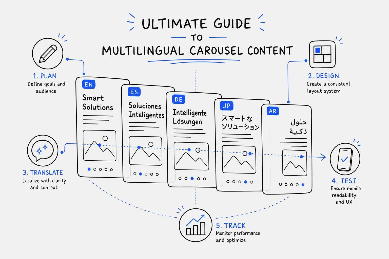
If I want multilingual carousels to work, I need to plan for translation before I design a single slide. That means I pick the audience, goal, language setup, slide format, text limits, and review process up front. If I skip that step, longer translations, layout issues, and weak message fit can hurt results.
Here’s the short version:
- I choose one goal for the carousel first.
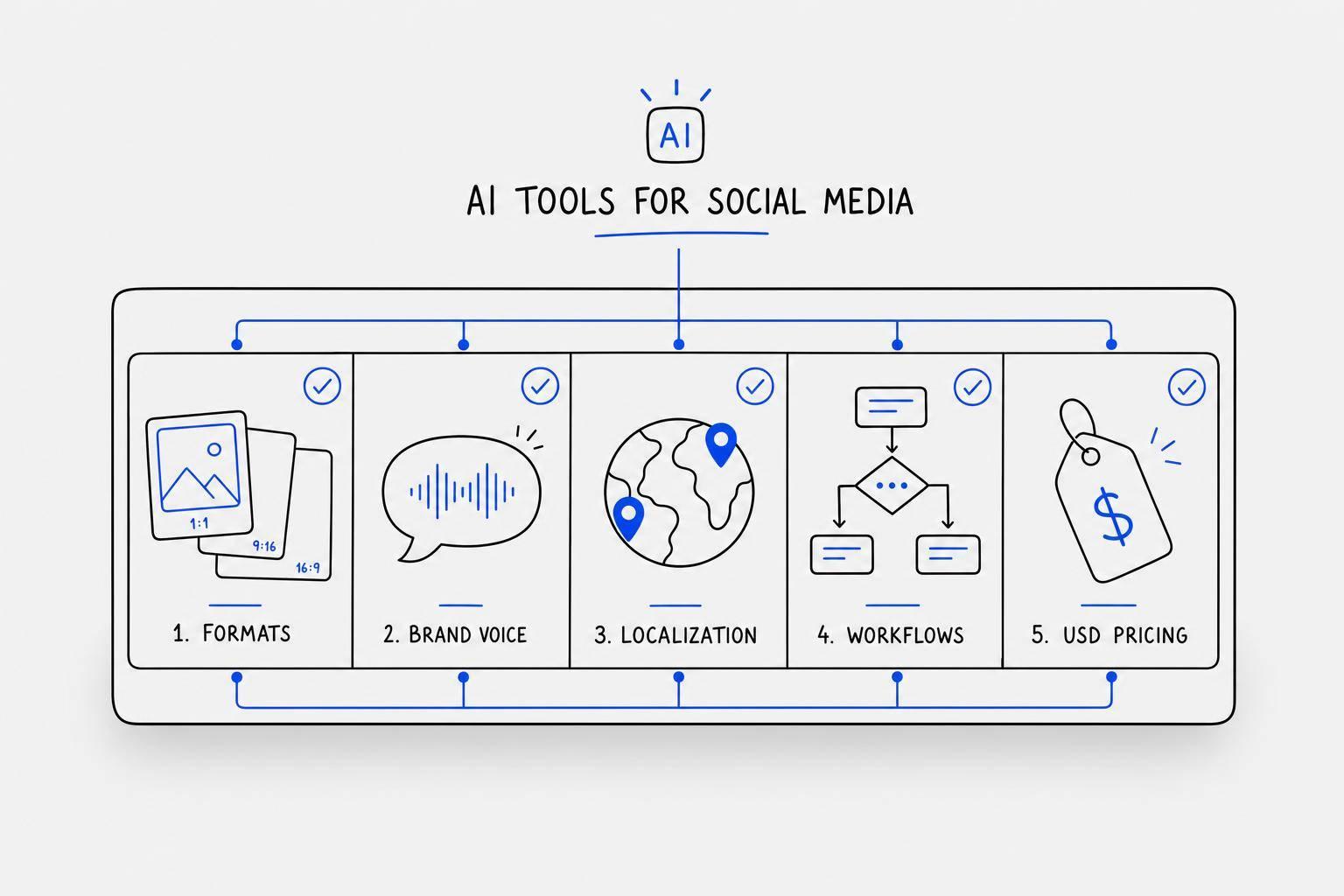
- I pick a specific language locale like es-MX, not just “Spanish,” and use AI tools for carousel design to maintain layout consistency.
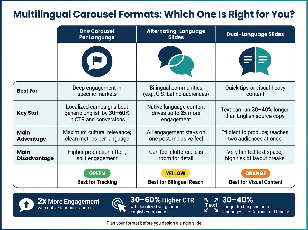
- I choose one format:
- One carousel per language
- Alternating-language slides
- Two languages on each slide
- I build slides with room for text growth because some languages can run 30%–40% longer than English.
- I keep source copy short, plain, and easy to translate.
- I localize dates, prices, units, examples, and CTAs for U.S. readers.
- I review every version on mobile before posting.
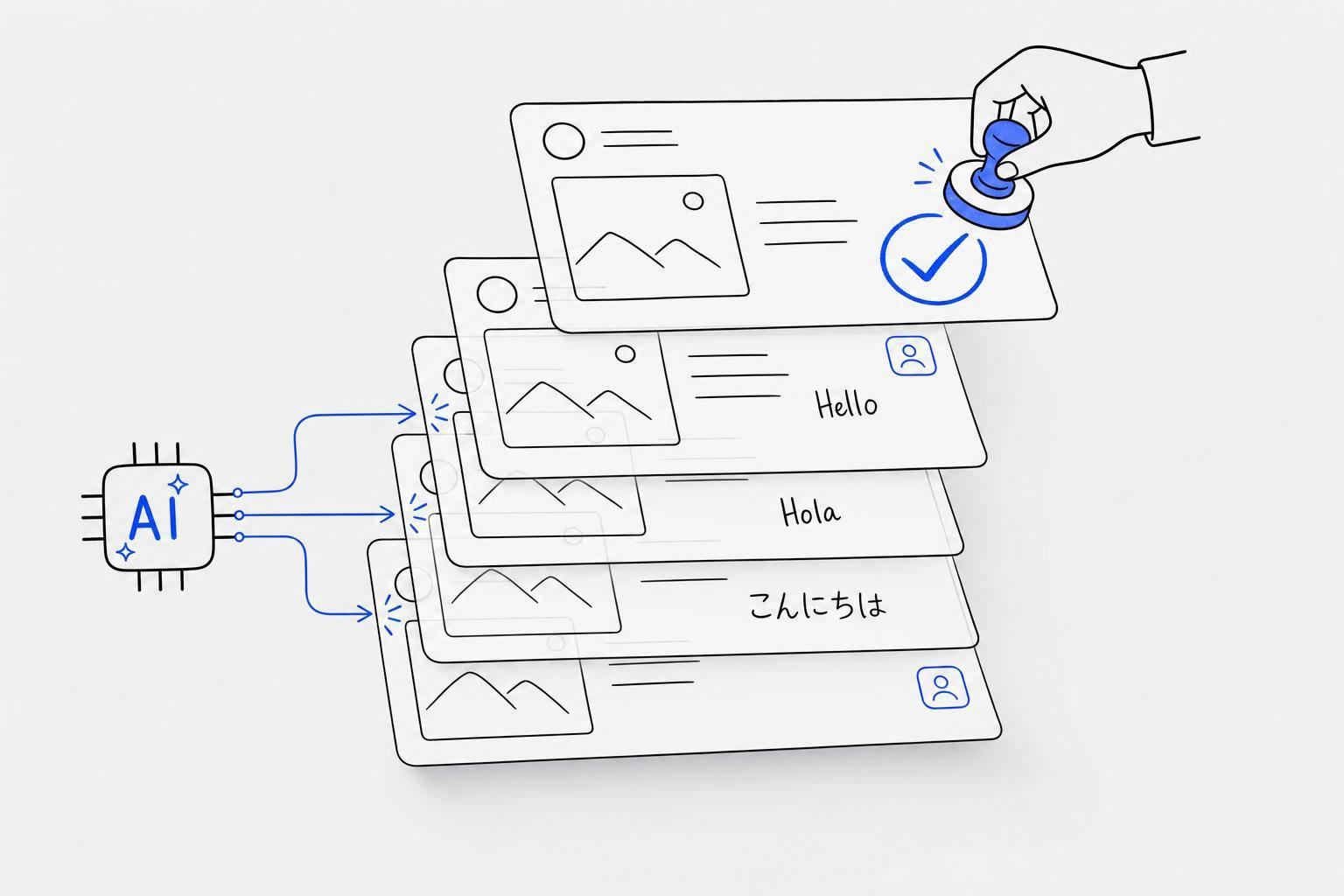
- I track results by language using metrics like CTR, swipe-through rate, saves, and conversions. To streamline this workflow, I often use AI tools for multilingual LinkedIn posts to handle tone and translation quality.
A few numbers stand out: native-language content can drive up to 2x more engagement, and localized campaigns can beat generic English campaigns by 30%–60% in click-through and conversion rates. So for me, the job is not just translation. It’s planning, layout control, review, and measurement.
| Format | Best when I need | Main tradeoff |
|---|---|---|
| One carousel per language | more room and cleaner tracking | more production work |
| Alternating-language slides | one post for bilingual readers | less space per slide |
| Two languages on each slide | short copy and visual-heavy slides | highest risk of clutter |
My takeaway: I get better multilingual carousels when I treat each language version as a planned part of the post, not a last-minute add-on.
Multilingual Carousel Formats: Which One Is Right for You?
What if one video, carousel or script could become multilingual content using AI .
sbb-itb-9f5fe42
Plan Your Strategy Before You Design
Set your audience, goal, and language plan before you touch the design. That saves you from the classic headache of rebuilding slides later. Once you’ve picked your platform-specific carousel format, lock those choices in before you write a single frame.
Choose Your Audience, Goal, and Language Setup
Your carousel’s goal drives the whole thing: how many slides you need, how the copy should sound, and how much text fits on each frame. An educational tip carousel needs a different approach than a product announcement or a lead-gen post. Pick one main goal first, then write around it.
For language selection, resist the urge to go too broad. Focus on high-volume but underserved languages where your audience is active and competition is lower. If Spanish is on the list, get specific. Use a locale like es-MX instead of treating Spanish as one giant audience. That extra precision can pay off. Localized campaigns can beat generic English content by 30–60% in click-through and conversion rates.
It also helps to match the language to the platform your audience already uses most. Meet people where they are.
After you’ve chosen your goal and language pair, pick the carousel structure that fits:
| Structure | Best for | Main advantages | Main disadvantages |
|---|---|---|---|
| One carousel per language | Deep engagement in specific markets | Maximum cultural relevance; clean metrics per language | Higher production effort; split engagement |
| Alternating-language slides | Bilingual communities (e.g., U.S. Latino audiences) | All engagement stays on one post; inclusive feel | Can feel cluttered; less room for detail |
| Dual-language slides | Quick tips or visual-heavy content | Efficient to produce; reaches two audiences at once | Very limited text space; high risk of layout breaks |
Once those choices are locked, map the story one slide at a time.
Build a Slide-by-Slide Content Map
A content map is just a simple planning doc that shows what each slide needs to say before design starts. Include the hook, the problem, the explanation, an example, a recap, and the call to action.
The big idea here is message hierarchy. The core point of each slide should feel the same across language versions, even if the exact wording or example shifts for a local audience. In plain English: each version should sound native, not like a stiff translation.
A smart move is to split the map into two buckets:
- Fixed elements: brand name, product terms, legal copy
- Flexible elements: hooks, idioms, and cultural references
This gives translators clear guardrails and helps you avoid clunky, word-for-word copy later. It also keeps the design steadier when text expands or the tone changes. Add character limits for each slide too. Languages like German and Finnish can run 30–40% longer than English, and that can wreck a tight layout if you didn’t plan ahead.
Treat localization as audience adaptation, not word substitution.
Set Up a Fast Workflow with Draft AI
Once your map is done, Draft AI can turn it into a carousel draft fast. You can paste in rough notes, share your business or blog details, or even send a voice message. Draft AI takes that input and generates carousel content in short order.
One handy part is the swipeable idea feed. At the planning stage, you can share your business or blog details and get a stack of ideas to swipe through, save, and reuse later. You choose the ones that fit your goal and build from there. No staring at a blank page. No burning time on ideas that were never a fit.
Draft AI can also translate inside the tool, learn your writing style, and keep fonts, colors, and photos consistent across languages.
Use this plan to design slides that still work after translation.
Design Carousel Slides That Stay Intact After Translation
Design for the longest translation first. Build for the longest version up front so every language fits the same system. Use the character limits from your content map to size each slide.
Use Layouts That Leave Room for Longer Text
Translated text almost always takes up more space than the English source. So the layout needs extra room from day one.
Before you lock the grid, stress-test it with long translated phrases. Use flexible text boxes and auto-sizing text so copy doesn’t spill out of the frame.
Portrait format (1080 x 1350 px) gives you more vertical space than square, which makes life easier for text-heavy multilingual carousels.
Once the frame handles longer copy, lock the brand rules and reading-direction rules.
Keep Branding, Readability, and Accessibility Consistent
Use one locked brand kit - logo, colors, and fonts - so each language version looks consistent. For CJK content, pick a font with full glyph coverage, such as Noto Sans CJK . For Arabic or Hebrew, mirror the layout: right-align text, move the logo to the top-right, and flip directional icons. Never mirror the logo. Use at least 44pt for headlines and key stats. Keep strong contrast between text and background so people can read it on all screens.
With the layout locked, the source copy can stay short, clear, and easy to localize.
Translate, Localize, and Review for U.S. Audiences
With the layout fixed, make sure every slide reads like it was written for en-US readers. Then shape the source copy so it translates cleanly without breaking meaning or layout.
Write a Source Version That Is Easy to Translate
Start with a source script that is simple to translate. Keep sentences under 15 words. Use plain, direct language. Skip idioms that do not travel well.
Before you send the script out, prepare a glossary of brand terms and a context packet. Include the brief, audience, and visuals so translators understand the tone, setting, and terms that cannot change. Mark what must stay exact, such as brand names, legal text, and hashtags. Also mark what can change, like idioms, CTAs, and emoji use. This step can cut review time and help translated slides stay closer to the planned carousel layout.
Once the source copy is clean, adjust the format, references, and tone for en-US readers.
Apply Localization Rules That Fit en-US Standards
Use en-US formatting across the full script. Write dates as MM/DD/YYYY, such as 06/19/2026. Put the dollar sign before the amount, use commas for thousands, and use a decimal point, like $1,299.99. Use imperial units, including Fahrenheit, miles, and pounds.
Formatting is only part of the job. Swap foreign business references or case studies for U.S.-based examples. Replace idioms with functional equivalents that land the same way for an American reader. Stay faithful to the meaning and tone, not the original sentence pattern.
Then use Draft AI's draft output for bilingual QA and device review.
Choose a Translation Workflow and Review on Device
Use Draft AI to create the first multilingual draft. Then run bilingual QA and mobile review before publishing. Draft AI's multilingual translation feature can produce carousel drafts in multiple languages within minutes. That gives your human reviewer a strong starting point instead of a blank page. After the AI draft, always do a bilingual QA pass to check tone, fit, and accuracy.
Finally, review each language version on a real mobile device before publishing. A slide that looks fine in a desktop editor may overflow, get cut off, or lose visual order on mobile. Check that CTAs are fully visible, text stays inside safe zones, and no slide feels too tight after translation.
Publish, Measure, and Improve Each Language Version
Publish Cleanly Across Instagram, LinkedIn, and Facebook
Once each language version clears review, publish it by platform and locale. Add locale codes to every filename, such as Ad_ES_MX or Carousel_FR_LinkedIn. It sounds small, but this step saves a lot of back-and-forth later.
For LinkedIn, export files as PDF or PPTX. For Instagram and Facebook, export each slide as a high-resolution PNG. Localize the alt text, filenames, and UTM tags so they match the caption. If you're running Meta ads, Meta's Dynamic Language Optimization can automatically serve the carousel version that matches the user's interface language.
Schedule every language version for its local peak posting window, and use UTC as the shared team clock.
Track Results by Language and Fix Weak Performance
After launch, compare performance by language version, not raw totals. Look at engagement rate, swipe-through rate, CTR, dwell time, and conversion metrics. Normalize results by audience size instead of total volume. Each market should be treated like its own audience, because that's what it is.
If one version lags, use the weakest metric to find where it's breaking down:
| Symptom | Possible Cause | Fix |
|---|---|---|
| Low saves | Content isn't evergreen | Add a checklist or summary slide |
| Weak first-slide retention | Hook too long or font unreadable | Shorten hook; fix font for target script |
| Poor CTA response | CTA too aggressive or landing page not localized | Soften ask; match landing page language |
| Drop-off after slide 1 | Slides too cluttered after text expansion | Cut 20% of words; split dense slides |
Review results on a regular basis so one weak hook or a badly timed post doesn't pull down the whole campaign.
Conclusion: Build a Repeatable Multilingual Carousel System
Multilingual carousel success comes from a system you can reuse: start with a clean master source, design for text expansion, localize for each market, publish by platform and locale, and measure performance by language. Then feed what you learn back into the next master draft.
Draft AI speeds draft creation and iteration across languages.
FAQs
Which carousel format should I choose?
Choose based on your platform and what you want the post to do. In general, 5–7 slides is a strong range for engagement, though you can go up to 10.
For Instagram, use 1080 x 1080 px square layouts for visual storytelling, tutorials, or before-and-after content. For LinkedIn, go with a presentation-style format for industry insights or data-driven advice. Draft AI can help with content ideas and customizable templates built for each platform.
How do I handle text expansion in translation?
Translated text is often 15% to 35% longer than English, so it helps to plan for that extra length from the start. Build text frames with longer target languages in mind, like German or Finnish, and turn on auto-sizing when you can.
If text still spills out, ask for a shorter re-translation instead of squeezing it into the design. And always QA the final template. Text that looks fine in a spreadsheet can still fall apart in the actual layout.
What should I measure for each language version?
Measure regional performance for each language version so you can see what lands in each market.
Track swipe-through rate, completion rate, dwell time, and comment sentiment. These metrics show where viewers drop off, where attention holds, and how people react. That makes it easier to fine-tune content for each language and locale.