Photo vs. Graphic: Choosing for Carousels
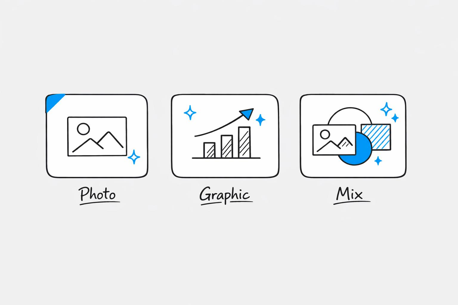
Photos or graphics? Your choice depends on your goals. Photos are perfect for emotional storytelling, building trust, and showcasing products in real-life scenarios. Graphics excel at breaking down complex ideas, presenting data, and maintaining brand consistency. You can create social media posts quickly by using efficient workflows. Want the best results? Combine both for higher engagement rates.
Key Takeaways:
- Photos: Great for emotional appeal, user-generated content, and behind-the-scenes moments. Challenges include maintaining consistency and production effort.
- Graphics: Ideal for tutorials, data visualizations, and structured content. Drawbacks include the time and design tools required.
- Mixed Media: Combines strengths of both formats, achieving the highest engagement rates (2.33% on Instagram).
Quick Comparison
| Format | Best For | Challenges | Engagement Rate (Instagram) |
|---|---|---|---|
| Photos | Storytelling, trust-building | Visual consistency, production time | 1.80% |
| Graphics | Tutorials, data, structured info | Time-intensive, requires design skill | 1.86% |
| Mixed | Versatility, higher engagement | Balancing formats | 2.33% |
Choose based on your audience and goals. Mixed media often delivers the best results, but both formats have unique strengths.
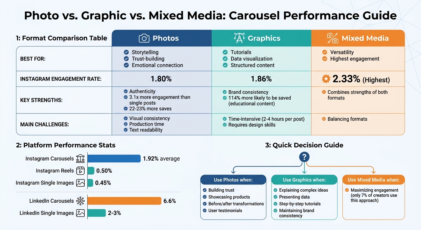
Photo vs Graphic vs Mixed Media Carousel Performance Comparison
Photos in Carousels: Pros and Cons
Benefits of Photos
Photos have a unique ability to create genuine connections that graphics often can't match. Behind-the-scenes shots and user-generated content help establish trust by showcasing real people, authentic products, and genuine moments. This relatability often leads to higher engagement and save rates.
Lifestyle photography is especially powerful for emotional storytelling. Whether it’s a before-and-after transformation, a product demonstration, or a brand's journey, real images tend to resonate more than abstract designs. In fact, photo-based carousels can generate up to 3.1 times more engagement than single-image posts and are 22–23% more likely to be saved. This makes them a strong choice for both sparking immediate interaction and creating lasting impressions.
Instagram's algorithm also gives photos a unique edge. If someone skips your carousel without swiping, the platform may show them a different slide later, effectively giving your content a second chance - something static posts don’t offer. Social media expert Mari Smith highlights this advantage:
"The data consistently shows that carousel posts generate significantly higher engagement because they create a more immersive experience for users"
These metrics highlight the effectiveness of photos in crafting engaging and memorable carousel content.
Drawbacks of Photos
Despite their many advantages, photos come with their own set of challenges. One of the biggest hurdles is maintaining visual consistency. Variations in lighting, mismatched color tones, or inconsistent styles across slides can make a carousel feel disjointed, potentially undermining audience trust. Unlike graphics, which can be standardized using templates, photos require careful editing to ensure a cohesive look.
The production process for photos is also resource-intensive. Achieving high-quality results involves proper lighting, staging, post-processing, and ensuring the images meet platform standards (at least 1,080 x 1,080 pixels). This often demands more time and effort compared to creating simple graphic designs. If the quality falls short, it can harm your brand's image and the authenticity you're aiming to convey.
Another challenge lies in using text overlays. Photos can create visual clutter, making it harder to read text on mobile devices unless there’s enough white space or contrast.
Comparison Table: Photos Pros and Cons
Here’s a quick breakdown of the strengths and weaknesses of using photos in carousels:
| Advantage | Disadvantage |
|---|---|
| Authenticity: Real images and user-generated content build trust | Inconsistency: Maintaining uniform lighting and color is challenging |
| Engagement: Boosts interaction by up to 3.1x compared to static posts | Production Demands: Requires significant time and resources for high-quality results |
| Storytelling: Ideal for engaging narratives like before-and-afters or product stories | Text Readability: Overlays can be difficult to read without proper design |
| Algorithm Advantage: Carousels may be re-served with different slides if initially skipped | Quality Control: Poor image quality can hurt brand perception |
sbb-itb-9f5fe42
Graphics in Carousels: Pros and Cons
Benefits of Graphics
Graphics play a key role in maintaining brand consistency by ensuring that colors, fonts, and logos are uniform across every slide.
They also make it easier to explain complex ideas. Whether it's tutorials, data visualizations, or educational frameworks, graphics break down information into manageable chunks. Digital marketing expert Qurratulain Awan puts it well:
"A well-built carousel gives you multiple chances to hold attention, clarify an idea, and earn the next swipe".
Interestingly, carousels designed for education or step-by-step guides are 114% more likely to be saved compared to static posts.
Another strength of graphics is their ability to create a clear visual hierarchy. By using elements like size, contrast, and whitespace effectively, you can direct viewers' focus to the most important details. This approach works particularly well for B2B content, listicles, and product walkthroughs.
But while these design strengths are impressive, they don’t come without challenges.
Drawbacks of Graphics
One major downside is the time commitment. Creating professional-quality graphics can take 2–4 hours per post, and it requires expertise in content creation tools and visual techniques.
Additionally, graphics may lack the personal touch of real photos. While they’re great for educational and authoritative content, they often fail to create the same emotional connection as images of people or products. Overusing decorative elements can also lead to visual noise, which distracts from your message.
Another issue is mobile readability. Text smaller than 24pt or with low contrast can be hard to read on smartphones. Without proper margins and safe zones, key parts of your design might get cropped on different devices.
Comparison Table: Graphics Pros and Cons
| Advantage | Disadvantage |
|---|---|
| Brand Consistency: Ensures uniform colors, fonts, and logos across all slides | Authenticity Gap: May feel impersonal or overly "corporate" compared to real photos |
| Clarity: Simplifies complex data with structured infographics | Time-Intensive: Takes 2–4 hours per post for professional-quality design |
| Visual Hierarchy: Guides attention through size, contrast, and whitespace | Design Skills Required: Non-designers face a steep learning curve |
| Educational Impact: Carousels for tutorials are 114% more likely to be saved | Readability Risks: Poor text sizing or contrast can make content hard to read on mobile |
Engagement Data: Photos vs. Graphics
How Each Format Performs
The numbers don’t lie - carousels consistently outperform most other content formats. On Instagram, carousels average an engagement rate of 1.92%, far surpassing Reels at 0.50% and single images at 0.45%. Over on LinkedIn, the difference is even more striking, with carousels achieving an average engagement rate of 6.6%. If you are targeting a global audience, using AI tools for multilingual LinkedIn posts can help maintain these high engagement levels across different regions. What’s even more interesting is how engagement skyrockets when formats are combined.
While photos and graphics perform well on their own, mixed-media carousels - those blending images and videos - lead the pack in engagement. For example, combining static visuals with video clips increases engagement to 2.33%. However, only 7% of creators are leveraging this approach. Instagram’s Head, Adam Mosseri, sheds light on why this works:
"Multiple pieces of media are going to mean more interactions with your carousel posts, and more interactions is going to mean more reach on average".
Instagram’s algorithm also gives carousels a second chance by re-displaying them, starting with the second slide, when users scroll past. This means your second slide needs to grab attention just as effectively as the first.
Recent case studies back up these findings. In May 2022, Phill Agnew, Senior Product Marketer at Buffer, analyzed 184 posts from the @Buffer Instagram account. His research revealed that carousel posts achieved an engagement rate 2.37% higher than other formats (3.45% vs. 3.37%) and were saved twice as often. For product-related content, "product-in-use" photos outperformed static product-only graphics by 28%.
Comparison Table: Engagement Metrics
| Format Type | Instagram Engagement Rate | LinkedIn Engagement Rate | Key Strength |
|---|---|---|---|
| Mixed Media (Images + Video) | 2.33% | N/A | Highest overall engagement |
| Image-only Carousel | 1.80% | 6.6% | Educational content, saves |
| Video-only Carousel | 1.86% | N/A | Sequential storytelling |
| Single Image Post | 0.45% | 2–3% | Quick announcements |
| Reels | 0.50% | N/A | Discovery reach |
When to Use Photos, Graphics, or Both
Best Uses for Photos
Photos shine when you want to create trust and foster an emotional connection. They're perfect for showcasing products or illustrating transformations, like before-and-after shots, offering multiple angles, and showing authentic progress.
Want to enhance credibility? User testimonials and behind-the-scenes glimpses do the trick. Lifestyle photos - such as a coffee mug on a desk or sneakers on a hiking trail - add a relatable touch, making products feel part of everyday life. These resonate more than generic product shots.
Best Uses for Graphics
While photos tell a story, graphics simplify and clarify. They're ideal for breaking down complex ideas, like step-by-step tutorials or how-to guides, allowing users to process each action at their own pace. Data visualizations - think charts, stats, or comparisons - are more impactful when presented as clear, easy-to-digest graphics.
Graphics also excel at structured content. Myth-busting posts, pricing breakdowns, and feature comparisons all benefit from text-based visuals that keep distractions to a minimum. If you're aiming for content that gets saved rather than just scrolled past, graphics are a smart choice. In fact, educational carousels are 114% more likely to be saved than single-image posts.
That said, combining photos and graphics can often deliver even better results.
Best Uses for Mixed Media
Mixing photos and graphics is a winning formula for engagement, averaging 2.33%, yet only 7% of creators use this approach. Here's how it works: start with a striking photo or bold graphic to grab attention, then transition into graphics for detailed explanations or proof, and wrap up with a clear call-to-action on a clean graphic slide.
This "hook and explain" strategy keeps viewers engaged by varying the visuals. For example, a product demo carousel could open with a lifestyle photo, move into graphics explaining features or benefits, and close with a photo of the product in action. To ensure a polished look, stick to 2-3 brand colors and 1-2 fonts across the sequence. This consistency ties the slides together, making the mix feel cohesive rather than jarring.
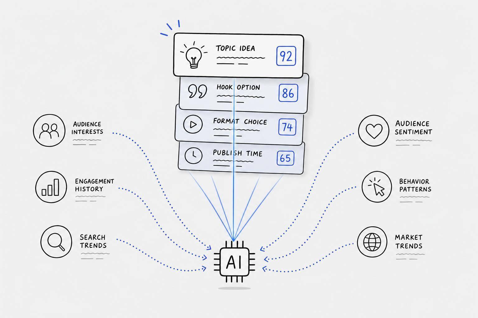
Building Carousels with Draft AI
Draft AI Features for Carousels
Draft AI takes the complexity out of creating carousels. Simply upload your photos into the editor, and the AI will automatically arrange them into a professional design. It builds your carousel with an attention-grabbing hook, engaging middle slides packed with value, and a clear call-to-action at the end.
The Brand Kit feature ensures a consistent look across all your slides by storing your logos, color palettes, and custom fonts. This means every slide maintains a unified visual style, no matter the content. Want to skip typing? You can record a voice memo (between 30 seconds and 2 minutes), and Draft AI will transform it into a polished, multi-slide carousel in less than a minute.
With over 100 professionally designed templates, Draft AI takes care of visual hierarchy and spacing for you. It even resizes your photos and graphics to fit platform-specific dimensions - like 1080x1350 for Instagram or 9:16 for TikTok - so you don’t have to worry about manual adjustments. Panoramic backgrounds provide seamless transitions between slides, giving your carousel a smooth, cohesive flow as users swipe through. These tools not only simplify the design process but also ensure your carousels are optimized for mixed-media content.
How Draft AI Handles Mixed Media
Draft AI goes beyond static images, making it simple to integrate mixed media into your carousels. Its customization editor allows you to tweak colors, fonts, and imagery in AI-generated drafts, helping you strike the perfect balance between your brand’s graphics and uploaded photos. This flexibility also lets you create "pattern interrupts" by mixing static images with text-based graphics, keeping your audience engaged.
Another standout feature? Draft AI can convert long-form blog posts into swipeable carousels in just minutes. It learns your brand voice to ensure the text graphics and visuals stay true to your style. The result is a cohesive and visually appealing carousel, whether you’re working with photos, graphics, or a combination of both.
8 GENIUS Instagram Carousel Ideas to Get More Followers & Engagement!
Conclusion
Choosing between photos, graphics, or a mix of both depends on your audience's preferences, your goals, and the platform you're using. Photos are ideal for building trust, showcasing products from different angles, or sharing genuine brand stories. On the other hand, graphics shine when simplifying complex concepts, presenting data visually, or walking viewers through step-by-step guides. Interestingly, combining these formats often leads to better engagement than sticking to just one.
The platform you’re targeting also plays a big role in shaping your content strategy. For example, Instagram carousels can achieve up to 13% more reach than other formats, while TikTok image carousels generate 81% more engagement compared to videos. Meanwhile, LinkedIn prioritizes document-style carousels for sharing professional insights. These platform-specific trends highlight the value of using diverse formats to maximize impact.
This is where Draft AI makes a difference. Whether you're working with photos, graphics, or both, the platform simplifies the process by handling layouts, ensuring brand consistency via your Brand Kit, and optimizing dimensions for each social channel. The result? Sleek, professional carousels tailored to your goals and the unique demands of each platform - all without the hassle of manual design work.
FAQs
How do I decide between photos and graphics for my carousel?
Choosing between photos and graphics comes down to what you want your content to achieve. Photos work well when you’re aiming to tell a story, build an emotional connection, or set a genuine, relatable tone - perfect for behind-the-scenes looks or visually pleasing content. On the other hand, graphics shine when you need to break down complicated concepts, create tutorials, or design infographics that visually emphasize key points. The decision boils down to your goal: evoke emotion with photos or deliver clear, educational visuals with graphics. Match your choice to your strategy to get the best results.
What makes mixed-media carousels perform better?
Mixed-media carousels stand out because they combine images and videos, offering a more dynamic and interactive experience. This format encourages users to swipe through multiple slides, boosting both dwell time and engagement. Plus, they’re perfect for storytelling - allowing you to share detailed information in an engaging way. In fact, they can generate up to 4x more engagement compared to single-image posts. The combination of diverse media and thoughtful storytelling makes these carousels more appealing and shareable.
How can I keep a carousel consistent when mixing photos and graphics?
To keep your carousel of photos and graphics looking polished and unified, aim for visual harmony through thoughtful design. Stick to a consistent color palette, typography, and overall style throughout all the slides. Each slide should reflect the same theme and branding, creating a smooth and cohesive experience. These design details help make your carousel visually appealing and professional.